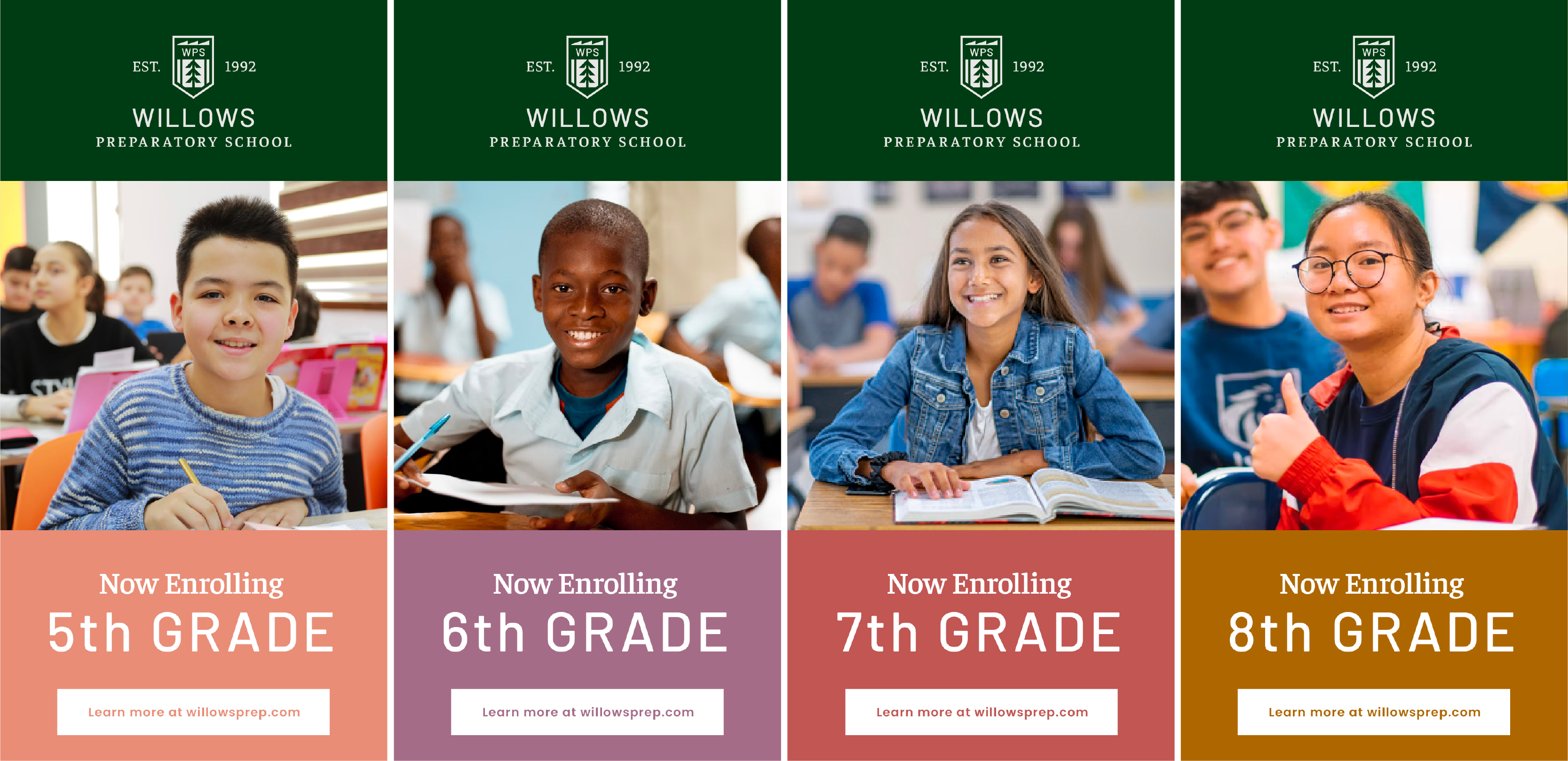
Willows Preparatory School
We designed a school's brand that's as distinguished as the education they provide.
Brand Strategy
Logo Redesign
Identity System
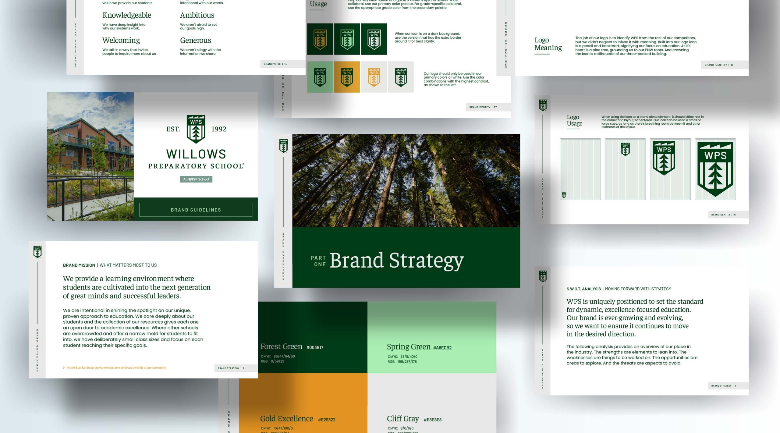
Brand Guidelines
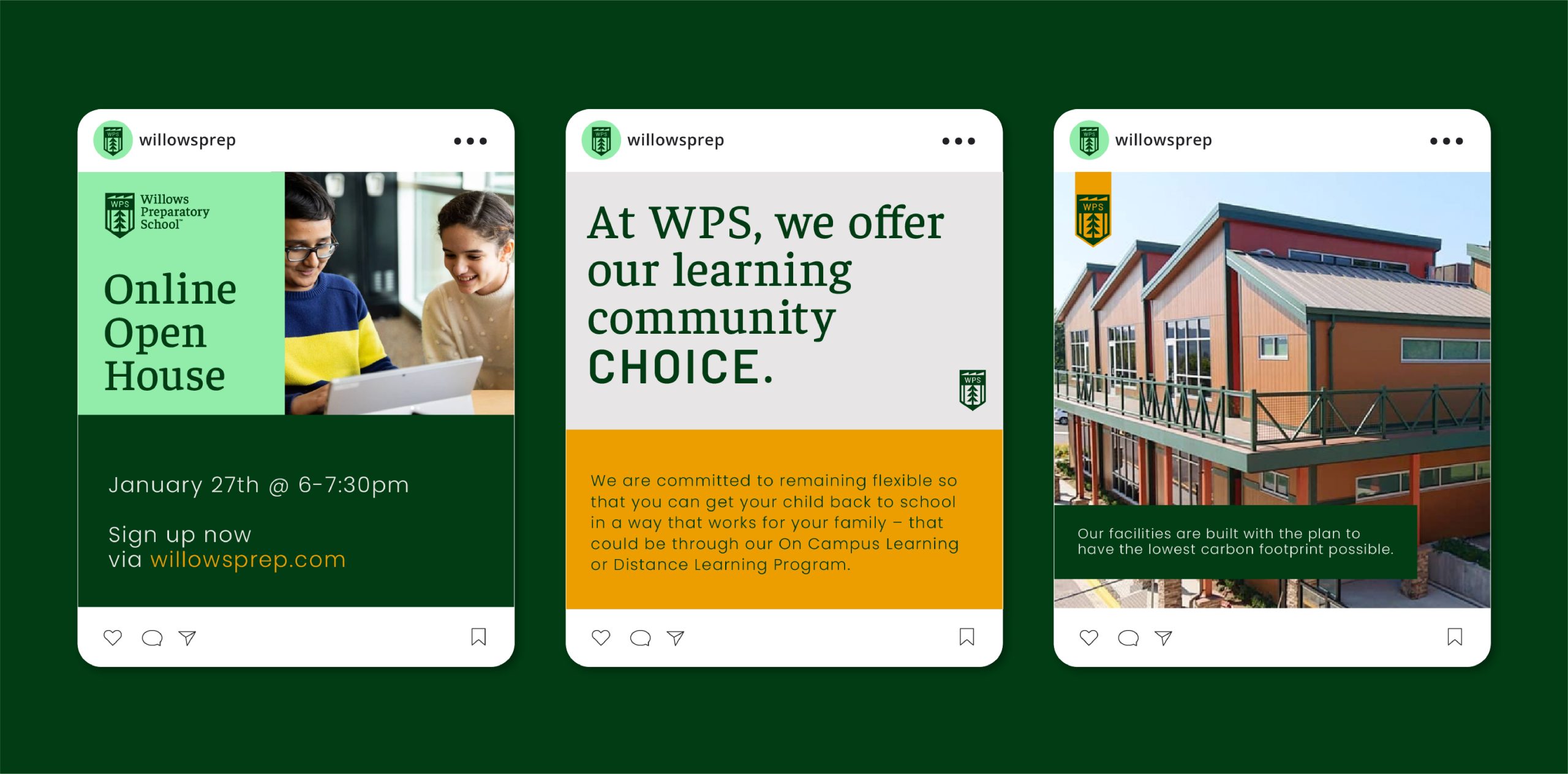
Marketing Collateral
Nestled in the lush pine-tree landscape of North Redmond, Washington, Willows Preparatory School (WPS) is a private grades 5-12 school with an IB curriculum and a student population with backgrounds from over 35 different countries.
WPS offers a top-notch education, but their outdated brand identity failed to communicate the diversity and excellence they foster. Together, we recreated it.
As the years ticked by, WPS continued its prestigious operation while its brand became sidelined and antiquated.The old WPS brand was unpolished and undeveloped, not indicative of the first-rate education landing WPS students at terrific universities and into prominent jobs in the STEM fields.
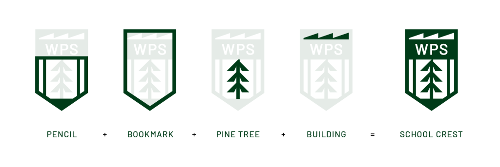
A pencil and bookmark, two images that instantly evoke the idea of education, are built into the logo’s icon. At its heart lies a pine tree, grounding the school in its Pacific Northwest roots. Crowning the icon is a silhouette of the school’s three-peaked building. Together, these elements compose a powerful and recognizable school crest that’s simple, yet deeply layered and nuanced
