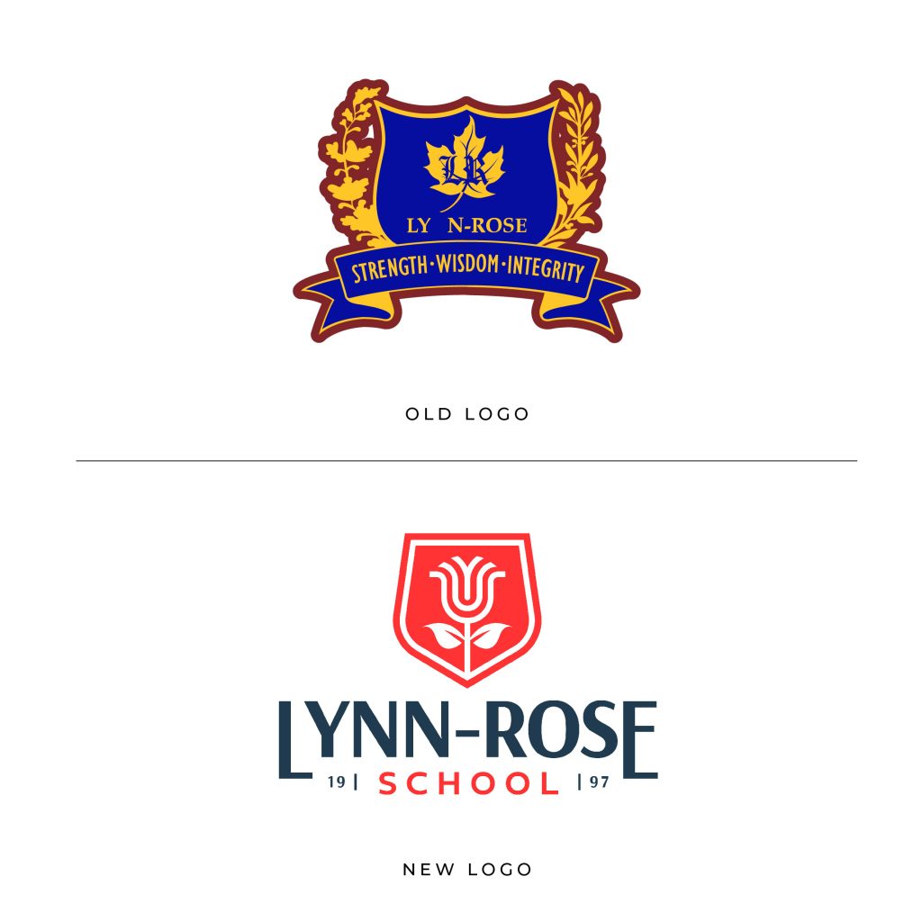
Lynn-Rose School is a premier private school in Ontario, CA, focused on delivering world-class education and creating independent learners. Their intricate, restraining logo was in dire need of an upgrade, as well as their visual identity system across both their campuses.
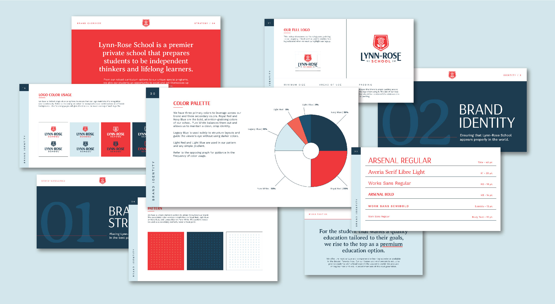
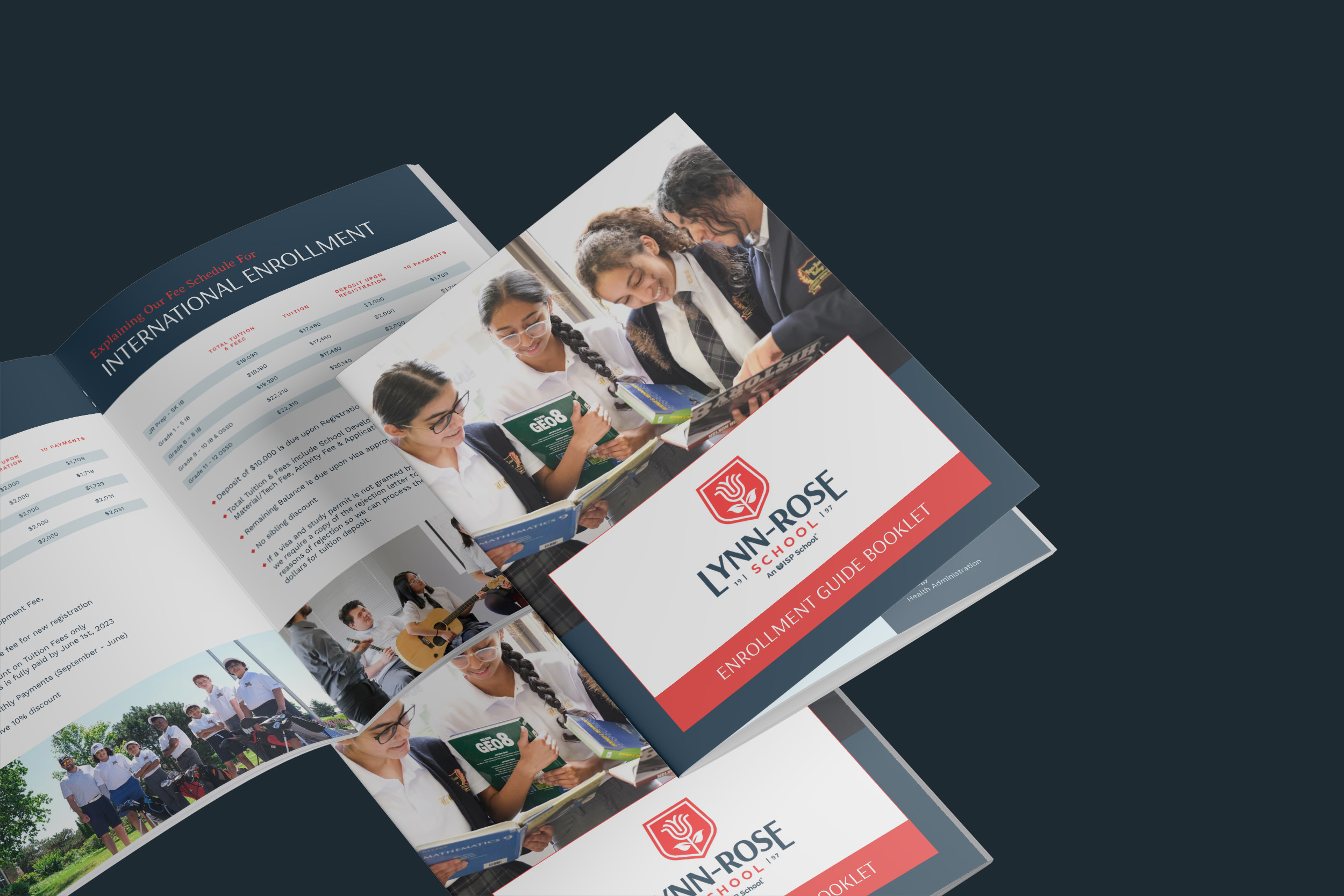
We worked with them to reimagine their brand, produce a more functional and compelling logo, and formulate a visual language that could impact every touchpoint of the Lynn-Rose brand.
We started with the icon. After tireless exploration, the final result is a simple, expressive rose blossoming inside a shield. Keeping a shield was a natural evolution from their old logo, and introducing a rose connects with their name and their promise of helping students flourish.
Giving the typography a more modern treatment helped convey the sophisticated approach Lynn-Rose takes with their education. We brightened the primary red, deepened the navy blue, and gave them a new color palette that is more refined and functional.
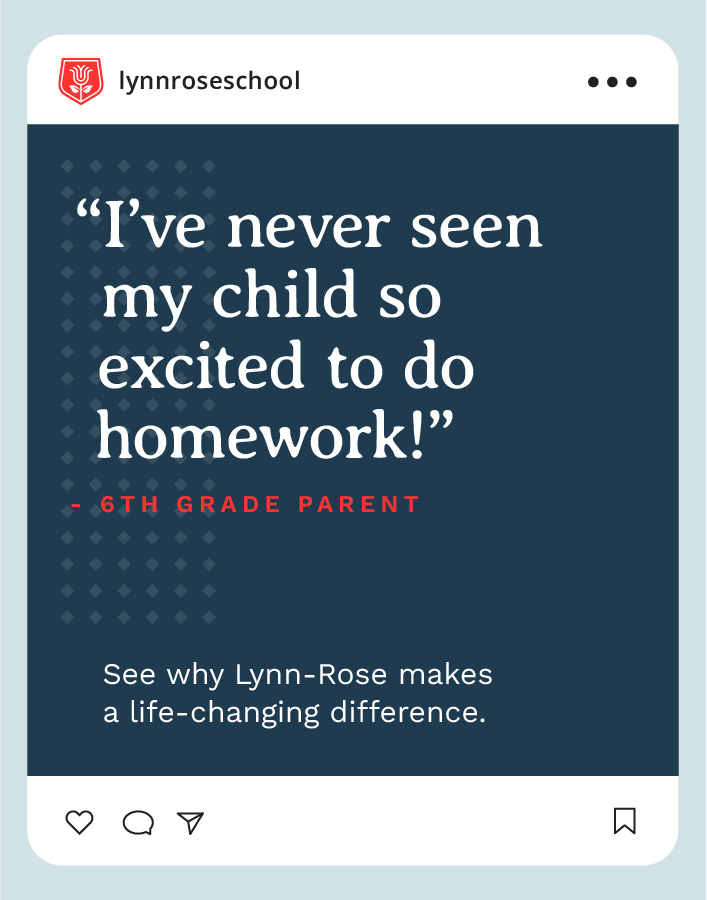
The new identity system will allow Lynn-Rose to increase recognition and better connect with their target market. Consistency in their visual assets help further establish them as a dependable, quality school. As they continue to grow, their brand is poised to be a catalyst in reaching the next level of success.