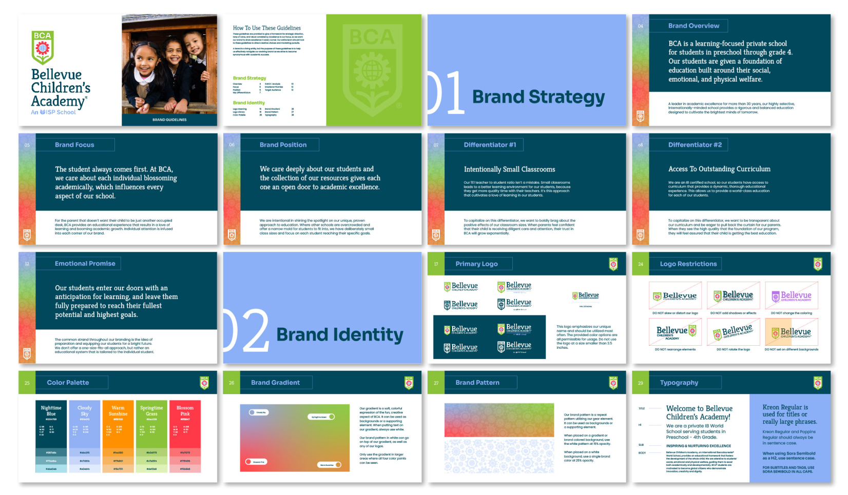
Bellevue Children’s Academy (BCA) is a private K-4 school with an IB curriculum and a student population with backgrounds from over 35 different countries. At the heart of BCA is curiosity and cultivating a love for learning. It was time for their brand to reflect that.
Their old logo didn’t convey the combination of creativity and foundational tools that each student receives. We crafted a layered logo that touches on the unique attributes that makes BCA desirable for so many future-focused families.
Flexible and functional, the new logo sets the right mood for the school. Even at a glance, it’s crystal clear that BCA is an exciting place of learning that is built with experience and quality.
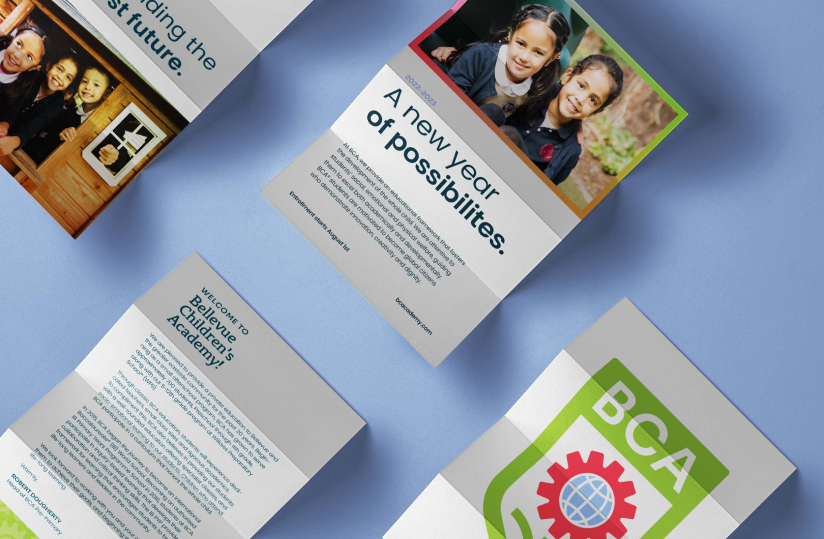
A school designed for the curious child should speak to the vibrant way children view the world. We equipped BCA with a thoughtfully expressive color palette, typography, and pattern. All of the strategy and design work is defined and documented in their new brand guidelines. As they produce a myriad of marketing and internal collateral, the new identity system will allow them to have cohesion at every brand touchpoint.
